Table of Contents
ToggleChoosing a paint color for your living room shouldn’t feel like a high-stakes decision, yet many homeowners agonize over warm whites versus cool grays for months. The truth is simpler: neutral colors work because they’re the foundation everything else rests on. Whether you’re planning to update your existing space or starting fresh after a renovation, neutral living room colors provide flexibility, longevity, and a calming backdrop that won’t feel dated in a few years. This guide walks you through selecting the right neutral shade, understanding the differences between warm and cool neutrals, and adding depth so your room feels intentional rather than bland.
Key Takeaways
- Neutral living room colors provide a timeless, strategic foundation that won’t feel dated in a few years, making them more valuable long-term than bold accent walls or saturated colors.
- Test paint samples in large poster-sized swatches on your walls for a full day-night cycle to account for how natural and artificial lighting shifts neutral shades throughout the day.
- Warm neutrals like beige and taupe create cozy atmospheres suited for rooms with warm wood tones, while cool neutrals like soft gray work best in bright spaces with cool-toned elements.
- Avoid treating neutral living room design as a blank box by layering textures, finishes, and architectural details—such as accent walls, varied paint finishes, and natural materials—to add intentional depth and character.
- Neutral walls appeal to broader audiences if you sell, simplify future décor changes, and hide wall imperfections better than bold colors, making them a practical financial investment.
Why Neutral Colors Work Best for Living Rooms
A neutral living room color isn’t invisible, it’s strategic. Neutral shades like beige, gray, taupe, and greige form a calm visual backdrop that lets furnishings, artwork, and architectural details take center stage. This matters because living rooms function as your home’s main gathering space. You’re watching TV, reading, entertaining guests, and shifting light throughout the day, all while that wall color has to perform.
Neutrals also outlast trends. Bold accent walls or saturated colors can feel dated within five to seven years, but a well-chosen neutral remains timeless. More practically, neutral walls simplify future changes, swapping throw pillows, furniture, or decor is effortless when your base isn’t competing for attention.
From a financial perspective, neutral rooms appeal to a broader audience if you ever sell. Real estate agents routinely advise painting bold colors neutral before listing, which means you’re future-proofing your investment. Also, neutral paint typically hides minor wall imperfections and wear patterns better than bold colors, meaning touch-ups stay less visible over time.
Popular Neutral Paint Colors for Every Style
Neutral doesn’t mean one thing. The right neutral depends on your home’s natural light, the mood you want, and whether your décor leans toward warmth or coolness.
Warm Neutrals: Beige, Taupe, and Warm Gray
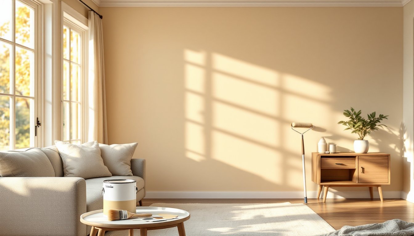
Warm neutrals carry underlying yellow, orange, or red undertones, creating a cozy, inviting atmosphere. Beige remains the classic choice, accessible, forgiving, and easily pairs with both traditional and modern furnishings. Look for quality interior paints with names like “Accessible Beige” (Benjamin Moore) or similar formulations: budget roughly $30–$50 per gallon for mid-range brands, with better coverage on second coats.
Taupe sits between gray and brown, offering sophistication without starkness. It works especially well in rooms with warm wood tones or if your living room gets afternoon sunlight that casts golden light. Warm gray (sometimes labeled “greige” when it edges cooler) brings depth while maintaining approachability. These shades complement both traditional baseboards and minimalist spaces.
When selecting warm neutrals, always test paint samples on your walls in morning, afternoon, and evening light. Artificial lighting can shift a warm neutral toward pink or orange, so observe it under your actual overhead and lamp lighting before committing.
Cool Neutrals: Soft Gray, Greige, and White
Cool neutrals carry blue, green, or purple undertones, creating a serene, airy effect. Soft gray has dominated modern design because it pairs seamlessly with stainless steel appliances, cool-toned wood, and contemporary furnishings. It also works in spaces with cooler natural light (north-facing rooms).
Greige (gray + beige hybrid) bridges warm and cool, useful if you’re uncertain which direction your décor should lean. It’s forgiving and works in transitional spaces blending traditional and modern styles. White and off-white might seem obvious, but they’re powerful when chosen intentionally. Bright white reads clinical in some rooms, while off-whites like “Swiss Coffee” (Benjamin Moore) or “Alabaster” (Sherwin-Williams) provide cleanliness without coldness.
Cool neutrals show imperfections and dust more readily than warm neutrals, so they work best in well-maintained spaces and benefit from semi-gloss or satin finishes that are easier to wipe clean. Interior design inspiration across multiple styles can help you visualize how cool neutrals work in your preferred aesthetic.
How to Choose the Right Neutral Shade for Your Space
Selecting your neutral comes down to three factors: existing elements you can’t change, the light in your room, and your personal preference.
Account for what’s already there. Your flooring, permanent fixtures, and any wood tones set the stage. If you have warm honey-toned hardwood, a cool gray might clash. Conversely, cool-toned tile or ash-colored wood calls for softer, cooler neutrals. Walk through your space at different times of day, a north-facing room with minimal direct light needs a warmer neutral to avoid feeling gloomy, while a south-facing living room with abundant afternoon sun can handle cooler, crisper shades.
Get actual paint samples. Never choose from a paint chip at the store. Pick three to five candidates and buy sample quarts (roughly $5–$10 each). Paint large, poster-sized swatches directly on your walls, at least 2 feet by 3 feet sections. Live with them for a full day and night cycle. The paint will shift under morning light, midday brightness, and artificial evening light. You’ll likely eliminate two or three immediately, and this simple investment saves regret and the cost of repainting.
Consider finish and undertones carefully. Paint finish affects how neutral shows: matte and eggshell finishes hide imperfections but show fingerprints: satin and semi-gloss finishes clean easily but highlight wall texture. Also, decor trends and room-by-room design inspiration suggest that undertone awareness matters more than saturation. A gray with green undertones feels different from gray with purple undertones, even if both are “soft gray.” When the salesperson asks, “Is this warm or cool?” listen carefully to their reasoning.
Test in your actual lighting. Natural light varies by season, latitude, and window direction. If you live somewhere with dramatic seasonal light changes, your neutral should handle both scenarios. In regions with long winters and minimal daylight (northern climates), a slightly warmer neutral prevents seasonal depression or a cave-like feeling. In consistently bright regions, you have more flexibility toward cool or crisp neutrals.
Bringing Depth and Character to Neutral Rooms
The biggest mistake homeowners make with neutral living rooms is treating them as blank, boring boxes. Neutrality is a foundation, not the whole story.
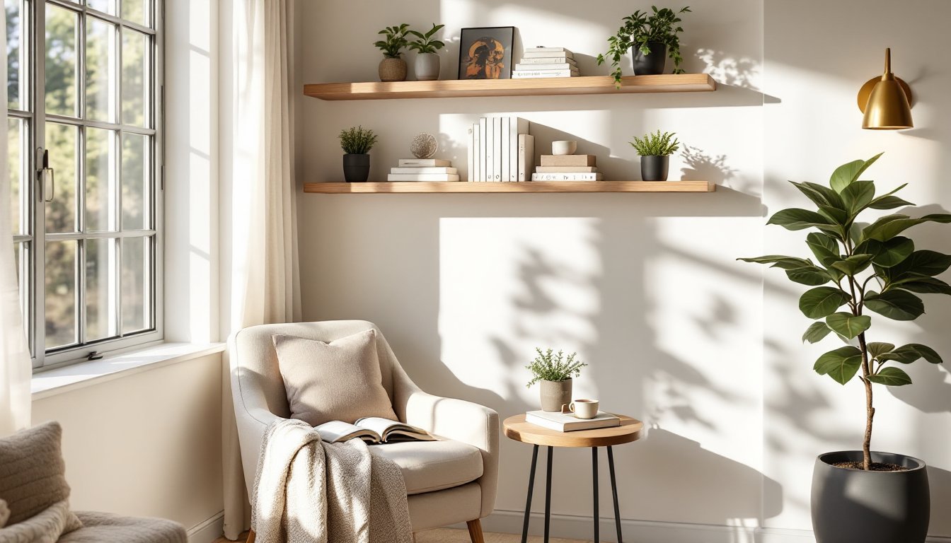
Layer textures and finishes. Flat paint on every surface reads flat. Break this by using different finishes: matte walls, satin trim, semi-gloss doors, or natural wood ceiling beams. Incorporate textured wallpaper on a single accent wall, or use a slightly deeper or lighter shade of your neutral on built-in shelving. These micro-variations create visual interest without introducing new colors.
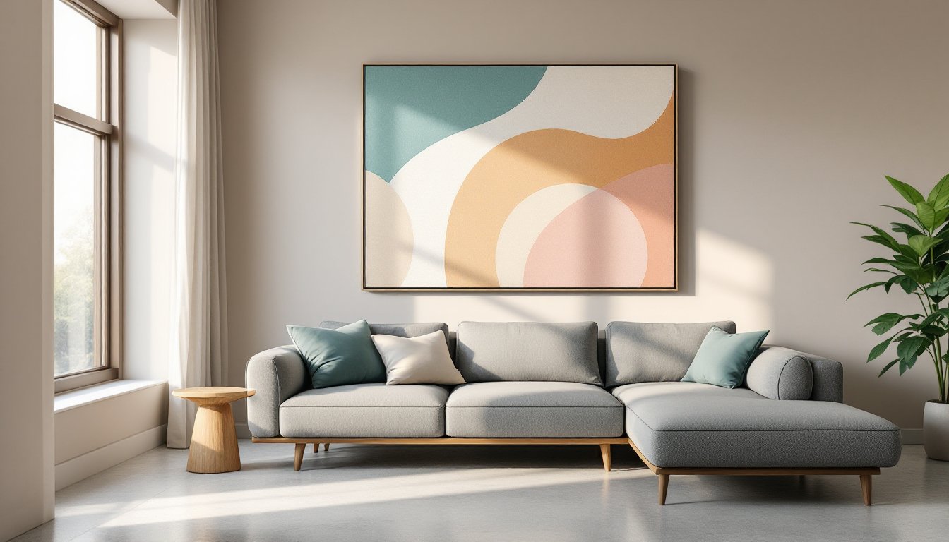
Use furniture and accessories strategically. Your neutral walls become the stage for a curated mix of furnishings. Introduce warmth through wood furniture, texture via linen or wool upholstery, and pattern through rugs, throw pillows, and artwork. A living room with neutral walls and a rich chocolate leather sofa reads completely different from one with neutral walls and pale linen seating. Neutral living room design ideas showcase how professionals layer neutrals with intentional accessories.
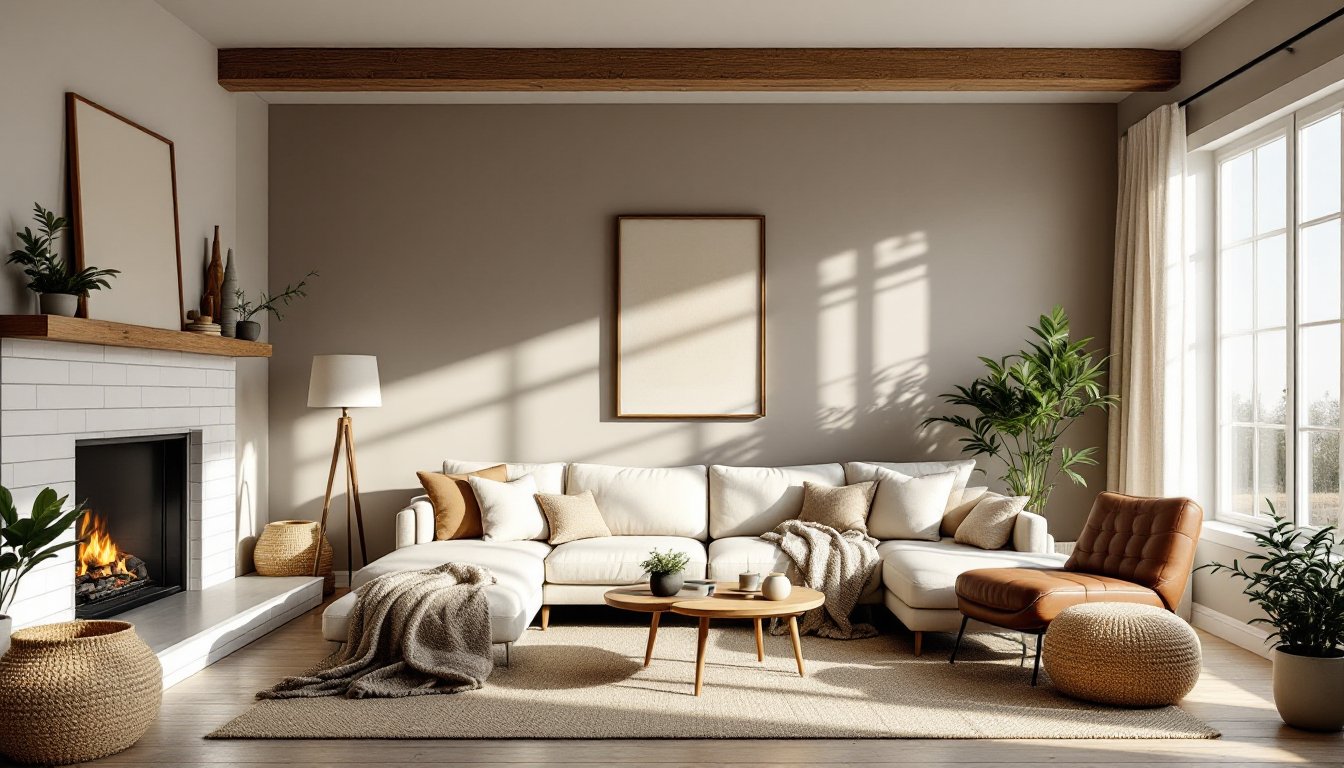
Add architectural details or accent techniques. Consider a dado rail (horizontal dividing panel at roughly 36 inches) painted in a slightly deeper or lighter neutral. A fireplace accent wall in a complementary texture (shiplap, stone, or tile) adds focal-point interest without color. You can also introduce subtle pattern through paint techniques, a matte base with satin stripe at picture-rail height, or a barely-there chevron or geometric motif in a close tone.
Bring in natural materials. Wood shelving, rattan baskets, jute rugs, and linen curtains introduce organic variation. These materials photograph beautifully and feel warmer than neutral paint alone. A stone fireplace surround, wooden beam ceiling, or natural plaster finish adds character that color alone cannot achieve. This approach works especially well in rooms where you want a serene, grounded aesthetic without personality feeling muted.
Conclusion
Neutral living room colors work because they’re intentional, not default. By understanding the difference between warm and cool neutrals, testing samples thoroughly in your actual light, and committing to layering texture and character, you create a space that feels both timeless and distinctly yours. Your neutral walls become the quiet foundation for the life and design choices you make within them, exactly what a living room should be.