Table of Contents
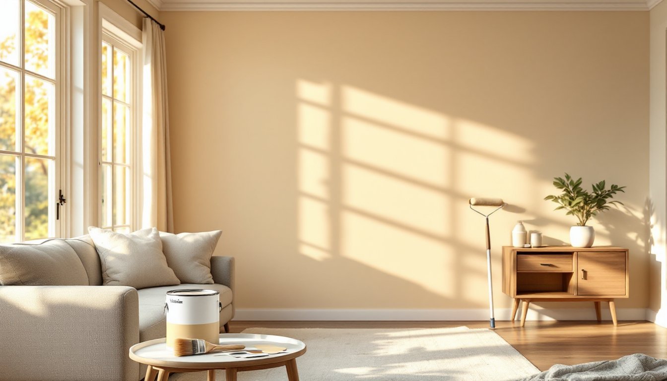
ToggleSpring is the season when homeowners finally notice how tired their living room walls look under fresh natural light. If you’re eyeing a paint refresh, the good news is that 2026 brings accessible color trends that work for nearly any décor style. Whether you’re drawn to warm neutrals that feel like home, cool blues that calm the mind, or bold statement colors that spark conversation, the right living room paint color can completely reshape your space without very costly. This guide walks you through current trending palettes, explains why certain colors work in living rooms, and covers the prep work that separates a professional-looking finish from a patchy regret.
Key Takeaways
- Warm neutral paint colors like soft creams and greiges are the safest, most versatile choice for living rooms because they complement natural light, hide imperfections, and adapt to any furniture style.
- Cool blues and grays create a calming sanctuary effect when paired with warm accents like brass fixtures and wood tones to prevent the space from feeling sterile.
- Living room paint color ideas for 2026 include bold jewel-toned statement colors—muted emerald, terracotta, and olive—which work best on a single accent wall in well-lit spaces.
- Always test paint samples in your actual living room for 24 hours under different lighting conditions (morning, afternoon, evening) before committing to a full gallon.
- Proper prep work—cleaning walls, filling cracks, using primer, and taping edges—is essential to achieve a professional-looking finish and prevent amateur-looking results.
- Invest in premium paint and quality brushes for statement colors, as budget paint shows brush marks and uneven coverage that undermines the sophisticated look you’re aiming for.
Warm And Inviting Neutrals
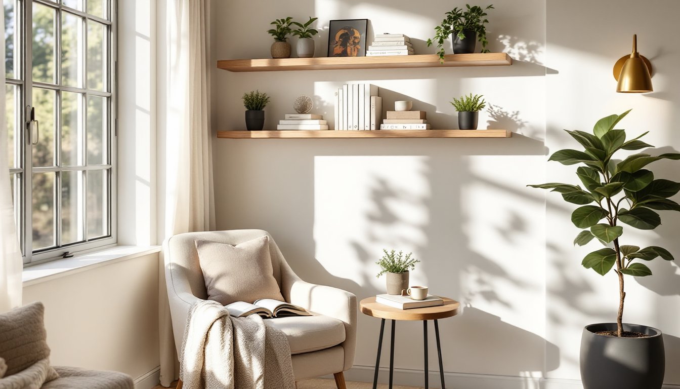
Warm neutrals remain the safest bet for living rooms, and for good reason: they complement natural light, work with any furniture style, and feel intentional rather than bland. Think soft creams, warm beiges, and soft greiges (that gray-beige hybrid) that sit just shy of white. These colors create an anchor that lets artwork, accent pillows, and wood furniture shine without competing.
The key to getting warm neutrals right is understanding undertone. A beige with yellow or warm red undertones feels inviting: the same beige with cool gray undertones can look dull or institutional. When shopping for paint samples, pick colors with names like “accessible beige,” “soft fawn,” or “warm linen” rather than generic “tan” or “beige.” Major paint manufacturers, Benjamin Moore, Sherwin-Williams, Behr, all offer warm neutral lines specifically calibrated for living spaces.
Why Soft Warm Tones Work Best
Warm tones naturally pair with the golden light from incandescent bulbs and afternoon sunlight streaming through windows. A warm neutral on a north-facing wall (which gets less direct sun) still reads as inviting rather than shadowy. These colors also hide minor wall imperfections better than pure whites: they’re forgiving.
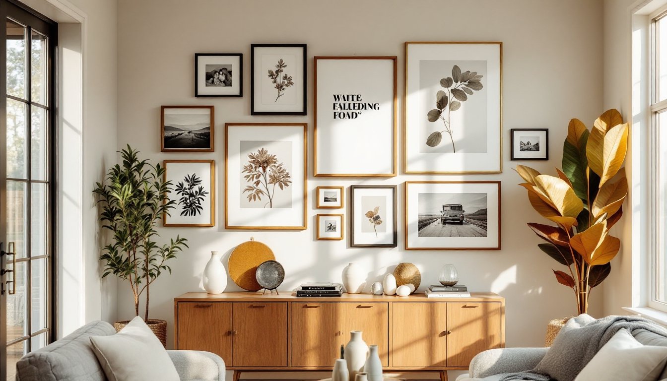
For furniture placement, warm neutrals act as a visual reset button. A living room painted in warm cream makes it easier to swap out throw pillows, curtains, or artwork without everything looking mismatched. Interior designers rely on warm neutrals as baseline walls because they sell homes and adapt to changing tastes. If you’re hesitant about committing to any color at all, warm neutrals are the professional starting point.
One practical note: sample at least three warm neutral swatches on different walls in your living room. Paint a 2-by-3-foot patch of each, let it dry fully (24 hours), and view it at different times of day. Morning light and evening light will shift how the color reads. This isn’t overthinking, it’s the difference between a finish you’ll love for five years and one you’ll repaint in two.
Cool, Calming Blues And Grays
Cool colors psychologically create calm. A well-chosen blue or gray in a living room can feel like a sanctuary, especially if you’re using the space as a stress-relief zone after work. The 2026 trend leans toward muted, sophisticated blues and soft grays rather than bright or navy tones. Think dusty blue, slate, soft sage-gray, or that pale blue-gray often called “greige” in designer circles.
The challenge with cool colors is that they can read as cold if the undertones skew too far toward pure gray or violet. A blue with slightly warm undertones (sometimes called a “warm blue” or “temperate blue”) feels more livable than a sterile, ice-toned blue. When you’re standing in a paint store, ask the sales associate whether a blue has warm or cool undertones. Carry a swatch home, and view it against your actual furniture and lighting before committing.
Grays are trickier than they look. There are warm grays (with slight brown or beige undertones), cool grays (with blue or purple undertones), and “true” grays that sit neutral. A cool gray can make a room feel sophisticated and modern, but pair it with cool-toned furniture and it becomes a refrigerator. Designers solve this by adding warmth through wood tones, warm-white trim, or warm accent colors.
Creating A Serene Escape At Home
A cool-colored living room is especially effective when paired with minimalist or modern furniture. The color doesn’t compete: instead, it creates a backdrop that lets you focus on comfort and conversation. Soft blue or gray walls also hide dust and fingerprints better than warmer tones, which matters in high-traffic living spaces.
To avoid a space feeling sterile, interior design inspiration from Home Bunch shows that cool colors work best when paired with warm accents, brass fixtures, warm wood shelving, cream-colored upholstery. The walls become the calm foundation while other elements bring in personality. If your living room has limited natural light (north-facing or small windows), test cool colors carefully: they can feel gloomy without enough brightness to balance them.
Paint coverage for cool colors is straightforward: a standard gallon covers roughly 350–400 square feet, assuming you’re applying two coats (essential for even coverage). Cool grays sometimes require a primer, especially if you’re painting over warm tones: ask your paint supplier whether the color you’ve chosen needs a primer coat to prevent the old color from bleeding through.
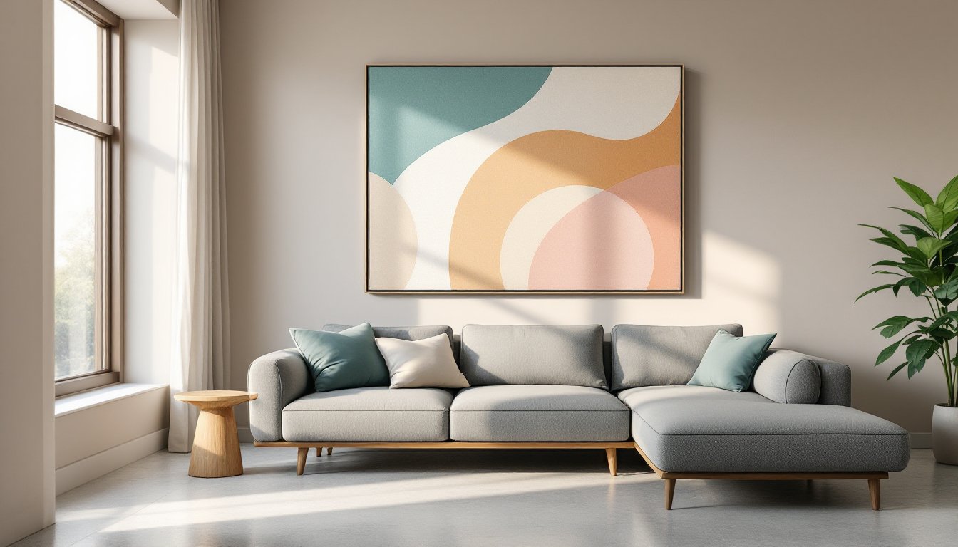
Bold And Trendy Statement Colors
If your living room has good bones and you’re ready to commit to personality, 2026 is trending soft, jewel-toned statement colors: muted emerald, soft terracotta, deep olive, and warm charcoal. These aren’t scream-at-you bright: they’re sophisticated and rich. A statement color works best on a single accent wall (often the wall you enter or the wall behind a sofa) rather than all four walls, unless your space is large and well-lit.
Statement colors require confidence and honest light assessment. A deep emerald or terracotta will absorb light and make a small, dim room feel smaller and dimmer. These colors shine in rooms with good natural light, high ceilings, or rooms you use primarily in evening (when warm accent lighting complements jewel tones beautifully). Apartment dwellers and those in smaller homes should test rigorously before committing.
The emotional weight of statement colors is real. Emerald reads sophisticated and slightly dramatic: terracotta feels warm and earthy: olive feels natural and slightly moody. Pick a color that matches how you want the room to feel, not just what looks pretty in a magazine photo. Color inspiration from designer roundups shows that successful statement walls pair bold colors with neutral, simple furniture and décor, if your living room is already busy, adding a bold wall color can feel chaotic.
Choosing The Right Bold Hue For Your Space
Before painting a statement wall, ask yourself: Is this a living room I’m planning to stay in for 3+ years? Do I have space to repaint if I change my mind (most rental agreements prohibit this)? Do I have good lighting to make the color look intentional rather than dark? A “yes” to all three means you’re ready for bold.
For statement colors, always use premium paint, not the builder-grade stuff. Bold colors often show brush marks and uneven coverage with cheaper paints. A premium formula applies smoother, covers in fewer coats, and hides minor imperfections. The cost difference is usually $5–10 per gallon, easily worth it when you’re committing to a dramatic color.
Budget makeover blogs like Addicted 2 Decorating often show DIYers successfully executing statement wall projects with proper prep and quality materials. The labor (your time) is free: investing in good paint and taking time for prep work is where ROI happens. Use a high-quality brush (not a foam brush) for the first coat on a statement color, cheap brushes shed bristles and create visible imperfections that ruin the sophisticated look you’re going for.
Testing And Preparing Before You Paint
Most DIY paint failures come from skipping prep. Painting over dirty walls, unprimed patches, or uncovered baseboards doesn’t save time: it creates extra work and a finish that looks amateur. Here’s the unglamorous but essential prep sequence.
Step 1: Clean and repair. Dust the walls thoroughly with a magic eraser or dry cloth. Fill any nail holes or small cracks with spackle (a putty that dries hard and sands smooth). Let spackle dry per manufacturer instructions (typically 2–3 hours), then sand lightly with 220-grit sandpaper until flush. Wipe off dust with a damp cloth and let dry completely. This step takes longer than painting but defines the final quality.
Step 2: Prime if needed. If you’re covering a bold previous color, stains, or glossy paint, primer is non-negotiable. A single coat of quality primer typically costs $15–25 per gallon and prevents old colors from bleeding through or affecting coverage. For warm neutrals covering warm tones, primer is optional: for dramatic color changes, consider it mandatory.
Step 3: Protect fixtures and trim. Lay down plastic sheeting over furniture (or move it out if possible). Use painter’s tape (the blue kind is standard) along baseboards, trim, ceiling line, and around light switches. Press the tape firmly at the edge to prevent paint seeping underneath. Poor taping is visible in the final finish and looks unfinished.
Step 4: Sample before committing. Buy sample pints of your top 2–3 colors. Paint 3-by-3-foot patches on different walls (a north-facing wall, a south-facing wall, an interior wall). Let samples dry 24 hours, dried paint looks different than wet paint. Observe in morning, afternoon, and evening light. This costs $20–30 and saves you from a $100+ gallon of paint you hate.
Safety: Ensure the room is well-ventilated. Open windows and doors or use a fan. Wear safety glasses and gloves: if using spray equipment, a respirator mask rated for paint fumes is essential. Many paint fumes can cause headaches and respiratory irritation: ventilation and PPE aren’t optional.
Tools and materials checklist: quality paintbrushes (2-inch and 3-inch), roller and extension pole, paint tray, drop cloth, painter’s tape, spackle, sandpaper, primer (if needed), your chosen paint (calculate gallons: typically two coats per wall), and a paint stirrer. Borrow or rent a paint mixer from your paint supplier to ensure thorough color consistency, paint settling in storage can create color variations.
These prep steps add a weekend to your timeline but the difference in a professional-looking finish is unmistakable. Rushed painting shows: thoughtful prep shows too.